Twilio
Post-Acquisition Design System

Overview
Twilio had acquired numerous businesses and standalone applications during rapid growth. Products, services, and tools were layered into feature pages without a design system. I was contracted to assess, harmonize, and deploy a design system for feature and product pages across the Twilio website.
Problem
The audit consisted of reviewing the entire site (~120 pages) across key viewports to find inconsistencies. Key issues included:
- Completely disparate design across the website—even navigation components and hello bar weren't consistent from page to page
- The experience was jarring for users moving between pages
- In-page navigation and sub-navigation were causing users to lose track of where they were
- Without breadcrumbs, a consistent navigation structure, or clear indication of the path a user took to arrive at a product's sub-pages, users couldn't explore critical information without frustration
- Pages that shared parent-child relationships had completely different navigation patterns
- Inconsistent buttons, CTAs, header/hero structure created wildly different experiences on related pages
Goals
- Unify the design system into a single navigation and sub-navigation that could work across page templates
- Minimize technical overhead by utilizing the tokens and components that existed in the CMS
- Leverage the existing brand library and illustration standards without adding net new system components
- Unify cards, blocks, and page rhythm to future-proof against the issue arising again after future acquisitions
Process
The interface inventory was laid into Sketch, where example views were dissected and rebuilt for unification. After the key differences were identified, a lowest common denominator approach was taken to ease development time and cost.
By building up from the baseline, or simplest, component that accomplished the job and already existed in the CMS, we could build atoms and molecules within those systems and layer them on to build flexible, responsive, and sustainable pages without creating massive debt.
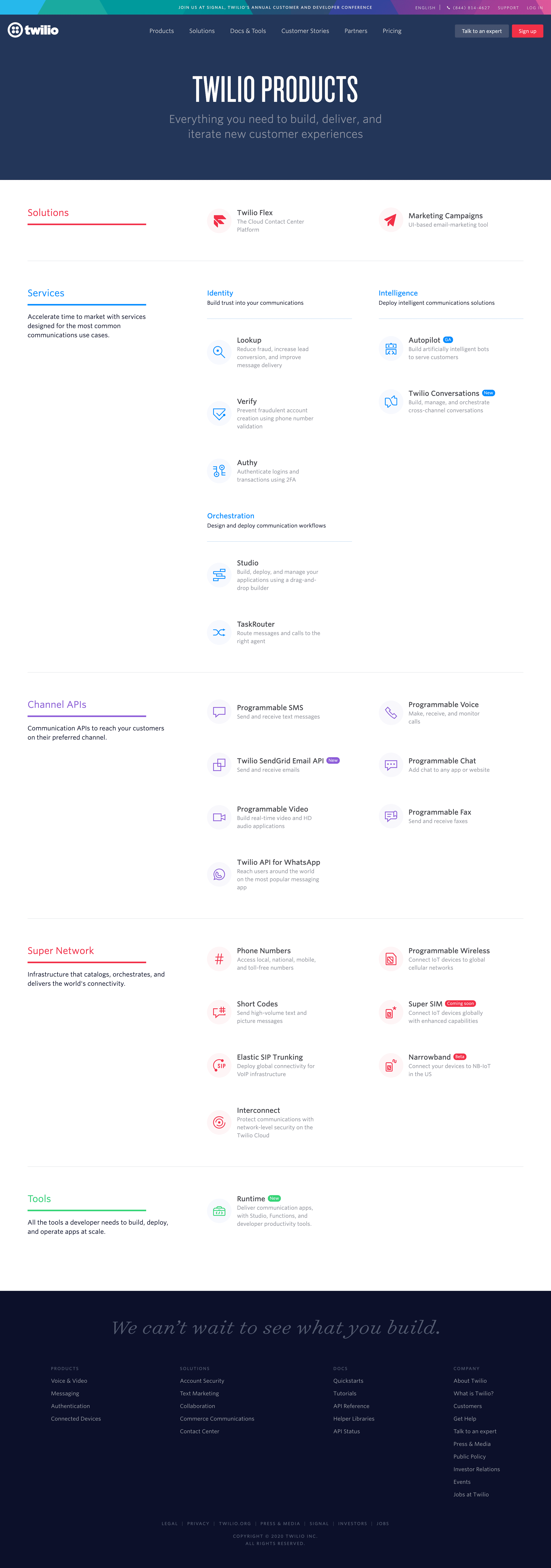
We cataloged every inconsistency across 120+ pages before proposing solutions, documenting the chaos with zoomed-out snapshots showing how different the site felt from page to page—no visual consistency, no predictable patterns.
Solution
Unified Navigation We created a single navigation system to rule all page types, eliminating the jarring experience of different navigation patterns on parent-child pages.
Atomic Component Library Built up from the simplest existing CMS components, we created an atomic library that could be combined in flexible ways without adding technical debt. This approach meant:
- Using existing tokens and components from the CMS
- Layering atoms into molecules and organisms
- Creating flexible, responsive, and sustainable page structures
- Future-proofing against post-acquisition sprawl
Consistent Page Patterns Centered vs. left-aligned sub-navigation issues were resolved. All pages sharing relationships now use consistent patterns. The design system unified cards, blocks, CTAs, and page rhythm across the entire site.
Result
Twilio was able to build a consistent website for their products that reduces confusion, increases conversion, and enables fast and efficient development. Thanks to our effort, the team knew where things stood, adjusted, documented, and learned key lessons to prevent future issues and keep things ready for continued growth.
The unified system made it possible to add new products and pages from future acquisitions without recreating the fragmentation problem.
Gallery
