The New York Times
App Navigation Redesign

Overview
I led the effort to redesign navigation across The New York Times digital products—creating a unified wayfinding system that would connect News, Games (Wordle, Connections, Crossword), Cooking, The Athletic, and Audio. This wasn't just rearranging tabs. It was rethinking how millions of subscribers discover, explore, and return to everything their subscription offers.
The challenge: make navigation easy and fun while serving five business units without feeling like a compromise.
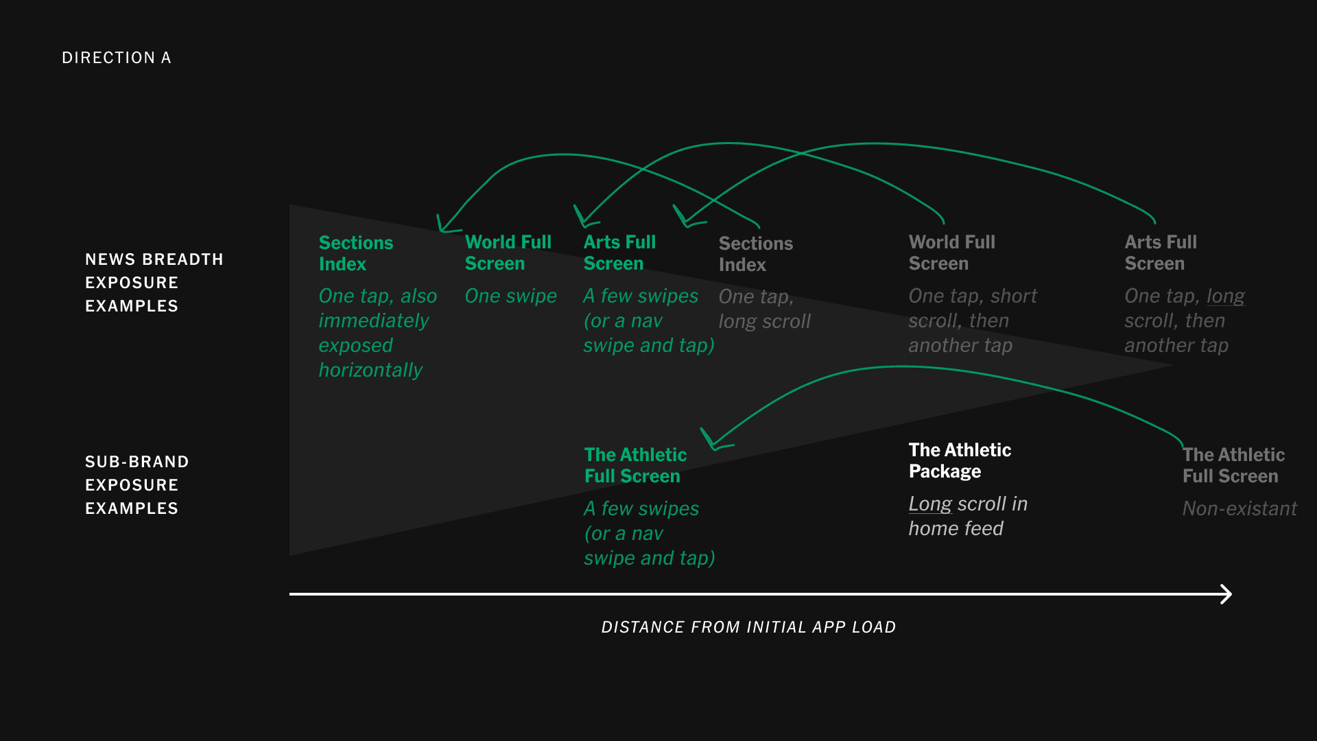
Problem
As Games, Cooking, The Athletic, and Audio saw astronomical growth, we faced a fundamental question: are we a super app? The answer was no—we're a news organization. But we have a lot to offer subscribers, and most of it was invisible.
We identified two core problems:
Awareness
The breadth of our news coverage and our full product suite was invisible to most users. Subscribers didn't realize what their subscription included beyond news.
Discoverability
Users struggled to find content within their interests. Navigation was confusing; they found it difficult to explore the full report and our products. The complexity of the current navigation made it hard to discover what we offered.
Product-Specific Challenges
Meanwhile, each product had its own needs:
- The Athletic required deep-linking due to content restrictions
- Games needed prominent placement to drive daily engagement
- Cooking had its own devoted user base
- Audio was growing fast
- News remained the core
The Athletic Integration Complexity
- Many NYT readers loved the existing NYC-focused sports desk and were wary of paying more for global sports coverage
- The Athletic's long-form journalism required layouts not found in our design system (Piano)
- Content restrictions meant Athletic articles couldn't fully live in the Core App—requiring deep-links while maintaining subscription and login state to work with paywalled content
We realized navigation was the lever to solve all of this.


Goals
User Goals
- Easily explore and discover all that is available to me
- Quickly catch up on the most important and interesting news of the day
- Help me go deeper on a topic
- Find what to read or do next
- Find something specific
- Store and find my things for later
Business Goals
- Drive the % of news-entitled subscribers engaging with 2+ products per week to impact engagement and All Access upgrades/retention
- Increase news exploration by helping users experience more of our report
- Demonstrate that the New York Times brand stands for news—and everything else we do
System Goals
- Create navigation that is easy and fun
- Serve five business units without feeling like a compromise
- Work for our existing design system and future needs
- Get users to the right content faster with fewer clicks
Process
Through extensive workshops with stakeholders from Games, Cooking, The Athletic, Audio, and Wirecutter, we developed four viable paths forward. Each had to work for our existing design system and future needs while keeping all business units engaged in conversations about where their content would land. It was not easy.
Aligning on Fundamentals
Along the way, we aligned partners on foundational distinctions—clarifying what our actual Home Page is, how it differs from section fronts, and how personalization would work without fragmenting the shared news experience.
We had to ensure that whatever solution we built would:
- Balance competing business unit priorities
- Maintain distinct brand identities within one cohesive system
- Handle deep-link and paywall complexity across standalone apps
- Make the complex content universe feel navigable
Research and Testing
We conducted extensive research and workshopping to understand what would be required to get users to content faster. Above all, we needed to reduce clicks and make the experience intuitive.
The Athletic as a Test Case
Integrating The Athletic served as a proving ground for the broader system. We had to:
- Review the entire design system to denote NYT Sports Content vs. The Athletic Content
- Keep both brands intact while creating a seamless user experience
- Build a transition system that made it clear when deep-link content was being viewed
- Provide easy paths to standalone apps when users wanted dedicated experiences
Our initial long-term goal was to sunset standalone apps and integrate everything into the Core App. But research changed our direction.


Solution
Sliding Navigation System
We built a sliding navigation system that understands a user's behaviors, favorites, and history—customizing both the tabs AND the feed for discoverability and preferences.
The system is live today and represents best-in-class navigation:
- Customizable tabs let users prioritize what matters to them
- Personalized feeds surface relevant content
- Sliding mechanism makes it easy to explore without overwhelming
- Clear visual hierarchy guides users to content
Product Integration Framework
For product integration, we developed a consistent approach that works across all properties:
- All content appears in the Core App feed using NYT styling
- Each product's content is visually distinguished with mastheads and a "charm bracelet" lower drawer
- Deep-linked content (like The Athletic) includes clear visual demarcation at transition points
- Users can move to standalone apps when they want a dedicated experience
The Athletic Integration
The Athletic became the new sports desk through three phases over six months:
- All content in the feed styled in NYT Core style
- Each Athletic article gets a distinct look in reading view with masthead and charm bracelet lower drawer
- Users get the option to move to The Athletic app (if downloaded) or are encouraged to download for better experience
The final deep-link flow shows how users move from Athletic content in the Core NYT App to the native Athletic app—with clear visual demarcation at each transition point.
Multi-Product Harmony
Games, Cooking, and Audio each received tailored integration that respected their unique needs while maintaining system coherence. The navigation connects all these products while respecting their individual brands and use cases.
Overwhelmingly, our users told us they preferred standalone apps for high-interest areas like Cooking, Audio, Games, and The Athletic. When they came across content in the Core App, they wanted to be sent to their preferred environment to interact with it. We made that easy to do and easy to understand.
Result
Business Impact
- The Athletic became the #2 driver of new subscriber revenue (just behind NYT Cooking)
- Athletic articles are the most-clicked non-news content in the Core News App
- Multi-product engagement increased significantly
- Subscription retention improved year over year
- Time on site and time in app increased, driving ad revenue
Product Success
- The Athletic earned its spot in the center of the sliding navigation, right beside Top News
- The solution shipped and is live today, serving millions of users
- The system we built became the foundation for how The New York Times thinks about its products as one connected experience
- Put The New York Times in the conversation as an elite source for breaking and long-form sports journalism
User Experience Win
By keeping standalone apps instead of sunsetting them, we actually increased retention—a result we didn't expect. Users got the best of both worlds: discovery in the Core App and deep engagement in dedicated apps.
The navigation system successfully solved the core problems of awareness and discoverability while balancing five business units, complex technical constraints, and maintaining distinct brand identities. It's not just live—it's the model for future product integration at The Times.
Check out this post from the publisher for more context.
Gallery