IHG
Multi-Brand Hotel Experience

Overview
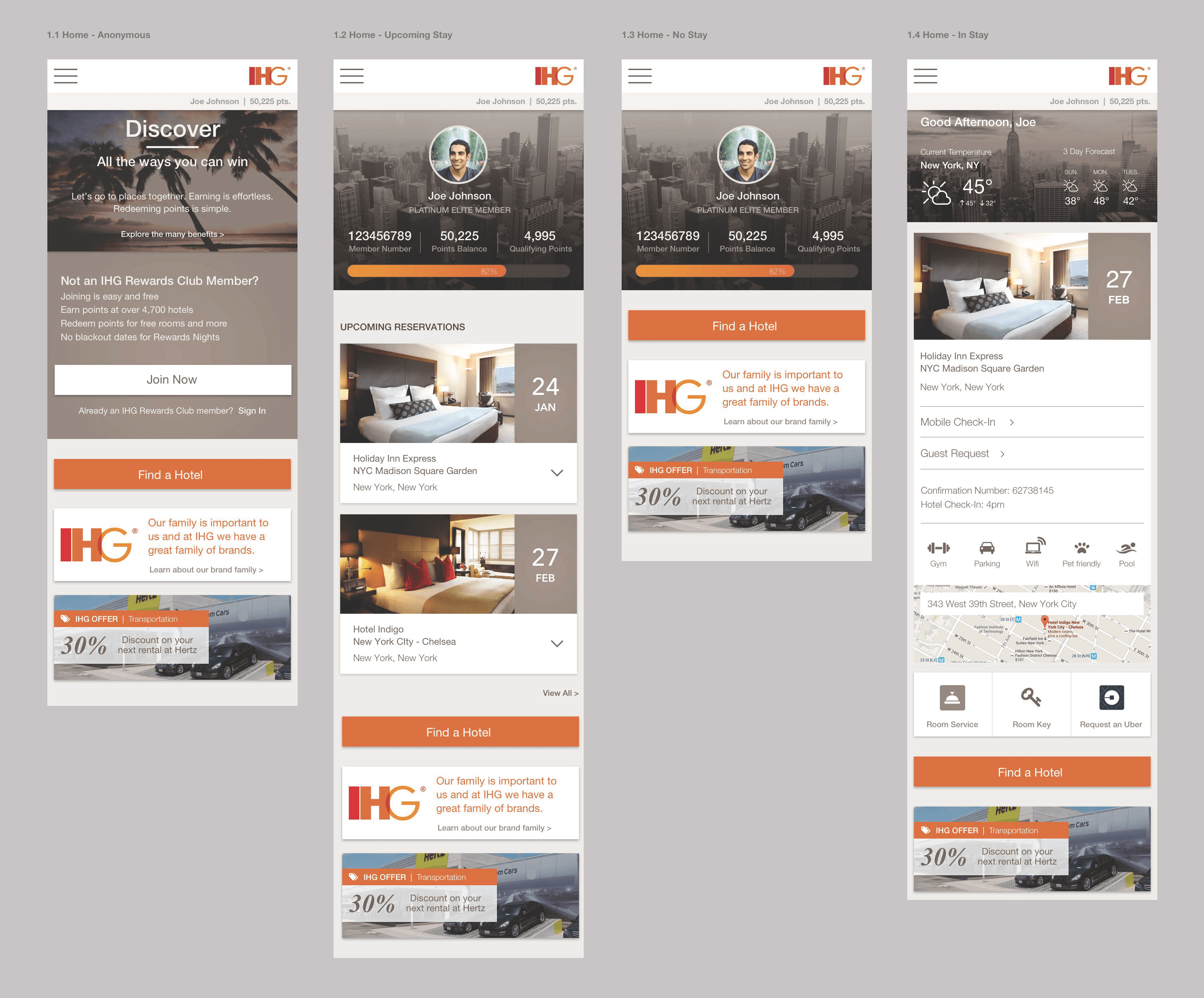
IHG had built their entire digital guest journey around Holiday Inn and Holiday Inn Express. The app wasn't built to handle their expanding portfolio of higher-tier and boutique brands, and their rewards and booking process were failing business goals. We worked for over a year to completely overhaul their digital guest process across mobile app, rewards program, and online booking into a unified experience.
Problem
IHG's digital experience was failing to serve their expanding portfolio:
- The app was built specifically around Holiday Inn and Holiday Inn Express
- Higher-tier and boutique brands weren't properly represented
- The rewards and booking process weren't meeting business goals
- Navigation was confusing across different brand tiers
- Users weren't encountering the information they needed when and where they expected it
- The existing UI couldn't accommodate the portfolio additions
Goals
- Create a unified information architecture that works across all IHG brand tiers
- Build a booking flow that reduces friction for all property types
- Improve the rewards program experience
- Ensure the experience feels premium for high-tier brands while remaining accessible for value brands
- Reduce the booking process complexity while maintaining necessary functionality
Process
We took deep dives into existing research and spearheaded new research projects to uncover customer wants and needs across all properties and programs.
Using the existing mobile app, we took customers through the booking, rewards, and stay management experience to uncover what was working and what needed to change. Results were documented in notes, diagrams, and presentations and our team worked with internal stakeholders to prioritize features and key changes.
After a few weeks of reviewing and refining our research, we arrived at the conclusion that the navigation/IA and the booking experience were the most in need of attention.
Our Lightbulb Moment: Going Analog For the first months of work, we leveraged existing research and worked with the existing UI to find a new solution that would allow the portfolio additions to be folded in. With dozens of teams and stakeholders involved, it was hard to determine what was actually a priority to the business and the user.
So, we made the decision to stop trying to retrofit what they had and started over. For three days, we took over a floor at IHG headquarters and held card sorting exercises, product workshops, and whiteboarding sessions with over 80 stakeholders across brand, revenue, sales, customer support, program development, design, engineering, and operations.
We ended up with 72 separate card sorting outputs that we then moved into quantitative data analysis groups. We then built a navigation interface in HTML and had folks drag and drop, telling us what felt right. We removed the interface all together. Then we grouped it by logic, mind-mapped it, and found our best version of the IA.
Analog: The Sequel We started back with post-it flows, breakdowns of features, and taking each item down to its simplest atomic level to find the right place and time for each part of the experience. Then, we printed (yes, actually printed) the existing booking application and started cutting the website apart with scissors and putting it back together as a team.
We spent two weeks running more internal employees and a few select power users through the experience and having them cut, paste, mark, draw, and tape their way through the experience they would expect if they could design the perfect app.
Solution
We started putting things back together and prioritizing features, business units, and user expectations. We then moved on to minimizing the interface, pushing relevant information to the front, and drastically limiting the amount of noise on the screen.
We built high-fidelity wireframes using a neutral palette while supporting the brand team as they began exploring a concept for using brand specific colors—Holiday Inn Green, Kimpton Light Blue—as interface elements. We helped them shape a new approach that would keep a key frame that was IHG-specific and allow the standalone brands to show up in subtle ways.
Interface Inventory Our scope of work was not a total redesign of the app—the in-house brand team had a good idea of where they wanted to go. But, we had to assess the existing IHG app and the disconnect users experienced when moving between property types. We knew that a brand refresh was coming down the road, but we took the time to clean up the UI standards for the brand to get our prototype in great shape for future builds.
Updating the Journey We deconstructed the user guest journey for Holiday Inn and began building an IHG-wide journey for all users and their needs spanning business, leisure, and rewards travel. We moved our focus to context-awareness and use-case specific interfaces for users based on their data rather than a one size fits all solution, which had been their approach thus far.
Matching Up with the Web Once we had our app experience and booking flow down, it was time to go back to the preferred method of booking for most power-users: the website. We created a universal experience between app and website, ensuring consistency across all touchpoints.
Result
The current IHG app, fully fleshed out by the IHG in-house teams, incorporates many of our critical changes to filtering, navigation, mapping, booking flow, room details, business offerings, and the color-coding system.
They've done a great job learning from our time together, building out even better ideas, and creating a calm and cool app that is simply a joy to use. The result is now considered one of the best rewards program experiences of any major hotel brand.
Gallery