Facebook Reality Labs
Internal OKR Tool

Overview
Facebook Reality Labs uses OKRs to measure internal performance. Product groups and sub-teams needed a better tool to create, approve, track, report, and summarize OKRs for executive leadership. I worked with internal partners and agency teams to overhaul the product interface and user experience.
Problem
The existing OKR system had several critical issues:
- The intake process relied on a long form full of dropdowns and inputs with no save state functionality
- Users frequently lost their progress and had to start over
- The complex and overwhelming dashboard provided insights that were too high level and required too many clicks to complete tasks
- There was no clear funnel process to match the OKR Creation for Product Teams process
- Prioritization, reporting, and dependencies were difficult to understand and manage
- The tool wasn't up to date with Facebook's XDR Design System standards
Goals
- Remove complexity from the existing intake process
- Add a save state to allow users to pause and resume their work without losing progress
- Remove the complex and overwhelming dashboard
- Create a funnel process to match the OKR Creation for Product Teams process that made prioritization, reporting, and dependencies easy to understand and manage
- Use the updated XDR Design System to get the Workstream and Intake tools up to date with Facebook's design standards
Process
The team started from the existing intake process and dashboard to determine where they were disconnected from Executive Leadership's goals and desires for OKR management and reporting. Through collaborative workshop sessions and card sorting, we determined what was working and what wasn't. We then prioritized which features needed to be added, removed, or modified to accomplish our goals.
Once we determined what we were building, we dismantled the existing workflow—which was long and tedious—and turned it into a stepped workstream that matched the Product Group OKR Process.
Solution
After we assessed, wireframed, and designed the new workflow, we tested it with the new XDR system and found several opportunities for consolidation and efficiency.
Stepped Intake with Save States The new progressive intake form includes save states and step navigation. Users can pause, resume, and track progress. This replaced both the old step-by-step process without progressive controls and a tested-but-failed single-view form that neither worked.
The final solution includes:
- Progress indicator showing where users are in the process
- Internal navigation allowing users to jump between sections
- Progressive save state so work is never lost
- Clear visual hierarchy using the XDR Design System
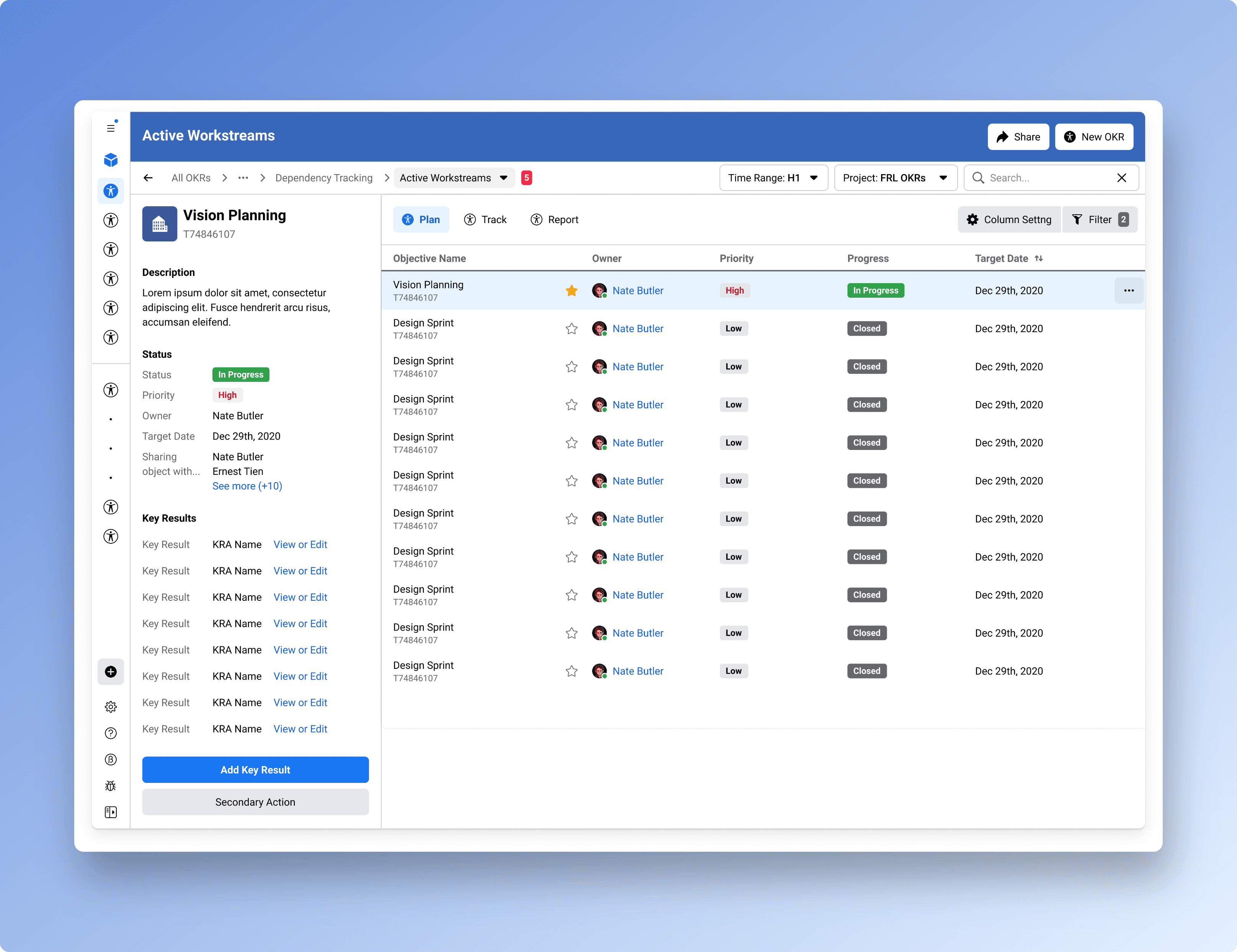
Dashboard Elimination The most significant change, outside of the step-by-step process, was the elimination of the summary dashboard all together. Users realized that summaries were bubbling far too many OKRs to the top. No more than 5 should be on the table at any given time. The constraints that we uncovered resulted in a more efficient internal process and an easier-to-use tool.
The removal of the complex dashboard resulted in a quicker jump to the work to be done and the ability to view any active OKR with ease. By adding the owner as a key data point, and allowing prioritization to be the driving column for rank, the critical information was now easier to scan and act upon.
Result
The new workstream landing page is clean, scannable, and focused on the actions users actually need to take. From here, sub-teams and working teams could roll up their reporting in formats that best-suited their initiatives and still work with a single intake process for OKR creation, approval, and tracking.
The simplified system improved prioritization by reducing the number of active OKRs surfaced to leadership, making it clearer what truly mattered and what could wait.
Gallery