Blue Apron
Subscription Experience Overhaul

Overview
Blue Apron had inconsistent experiences for activating, managing, and upgrading subscriptions. I led the internal team in creating new programs, overhauling the design system, and building new funnels and app experiences.
Problem
Blue Apron had four key initiatives that I led:
- Acquisition of new customers
- Upgrading existing customers
- Partner coupon integration
- Launching a brand new segment (Heat & Eat)
All while updating the design system for mobile app and website into one unified tool.
Specific problems included:
- The upgrade process to new and better programs and offers was not going well. Customer churn was high and one of the culprits was that skipping and modifying boxes had become difficult as the interface was jammed with marketing and management tools
- Conversion was not going well on both web and paid mobile ads, so a one-click checkout program was needed
- Ad inventory and activation programs were inconsistent in whether they opened the browser, the app, or a specialized landing page with a partner
- The design system had become disjointed between the mobile product and web product
Goals
We broke everything down to its elements and how they should work together. We asked:
- What is the most important thing on the page?
- Why does this belong here vs. here?
- How is this relevant to other items on the page?
- How many steps should this take and how can we keep things easy to understand but fast (and best for one-handed operation on the app)?
- What do we remove?
- What do we add?
Process
After assessing what was right, wrong, missing, or needed we started testing workflows with users. The first step was to drastically cut down the activation process (as we progressed toward our future one-click checkout solution) and see just how fast we could get someone from awareness to activation in the mobile app from a targeted ad.
Once we understood what users expected and needed to see, we removed features and consolidated views into less than half of the screens than we had before.
One of my first moves was to assess the app (focusing on iOS) and the website for disparity in process, activation, and layout. Normally, it's ok for the app and website to be different experiences all together. However, with Blue Apron, ad inventory and activation programs were inconsistent in whether they opened the browser, the app, or a specialized landing page with a partner. I had to unify the experience to ensure that the playing field was level for our qualitative and quantitative testing and to keep the user from being confused by inconsistent experiences if they responded on different surfaces.
Solution
Simple Task Bar We created a simple task bar, seen just below the upcoming deliveries section on desktop and locked to the footer on mobile, that handled all user management tasks for a weekly box: reschedule, change, skip, and modify. Modify leveraged a simple dropdown menu with quick actions. By cutting down the steps, assessing what users needed to do in the app, and moving marketing messages into the body of the page, we cleaned out the header and navigation and were able to create a unified management tool without ever having to leave the box screen itself.
We then devised a progressive reduction process to roll out the change over the course of three product releases, spanning four months, that would allow users to slowly move into the concept of a single control bar. We launched the reschedule in one click feature first, then we added in the skip function (with a simple unskip function as well), then in the penultimate phase we rolled out the unified more button with account management, and then launched in-line meal management in the box view last.
Creating a Single Interface for Preferences Once we had solved our biggest UI issue, we moved to tackling account management and dietary preferences. These settings were found in the order management screen, account screen, and the individual meals themselves. Users were often forced to change the meat (or non-meat) option each time or they would miss out on entire meals due to default settings and preferences.
Once we had the real estate to quickly move to preferences without losing a user's session, we created simple toggles for preferences that could be applied at the settings or individual box/order level.
A Non-Subscription Solution to Subscriptions Blue Apron had not offered a non-subscription product to date. We tested the first ready-to-go box that you could simply purchase. At a fixed cost and requiring no sign up, it served as a new entry point for Blue Apron Explorers (customers who had not converted) and provided powerful segmentation data for future marketing efforts.
Unified Coupon and Sharing Offer Designs One of our "smallest" but most impactful projects was creating a progressive discount tracker and simple referral page for gifting subscriptions. The coupon and gifting process were not available in the mobile app and were not easily found on the web app. We created a simple text link "view your balance" when applying coupons and a simple page for sending and tracking gift offers sent and redeemed.
Result
We were able to solve business problems that had plagued Blue Apron for quite a while and had led to churn among even loyal subscribers to the competition.
- The simplified management bar resulted in an 11% drop in cancellations quarter over quarter and has reduced overall churn by 6%. Users skip more often, but keep their subscriptions longer
- A significant uptick in wine sales, over 40%, occurred within the first six months of release
- The new landing pages, coupon programs, and non-subscription boxes had positive impact across the board on both customer acquisition and reducing ad costs
- The updated design system and solutions for admin were leveraged for future updates which have helped Blue Apron retain one of the highest-rated onboarding processes for subscription services
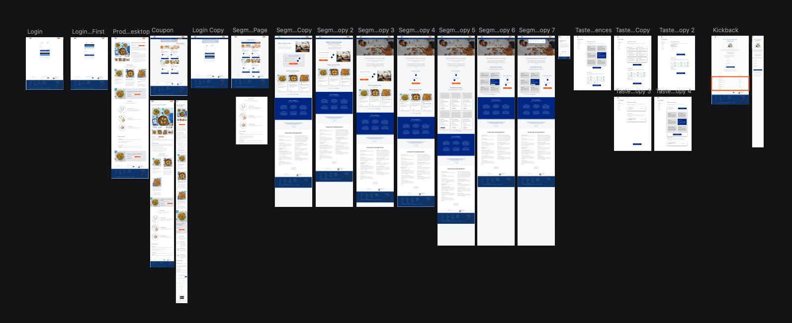
Gallery